-
home dongguan Houjie Industrial Park
Designing a Successful Perfume Packaging: Tips and Tricks
[ad_1]
Designing a Successful Perfume Packaging: Tips and Tricks
When it comes to designing a successful perfume packaging, there are several key elements to consider. From the fragrance itself to the color palette, typography, and overall aesthetic, every detail matters in creating a package that will stand out on store shelves and in customers’ minds. In this article, we’ll explore the key tips and tricks for designing a successful perfume packaging that showcases your brand’s unique identity and resonates with your target audience.
Understand Your Brand’s Identity
Before diving into the design process, it’s essential to have a solid understanding of your brand’s identity, including its values, values, and personality. This will help you create a cohesive and authentic packaging design that reflects the essence of your brand. Ask yourself:
- What are the key values and principles that guide my brand?
- What sets my brand apart from the competition?
- What kind of emotions and experiences do I want to evoke in my customers?
By answering these questions, you’ll be able to create a clear vision for your brand and the kind of packaging design that will best represent it.
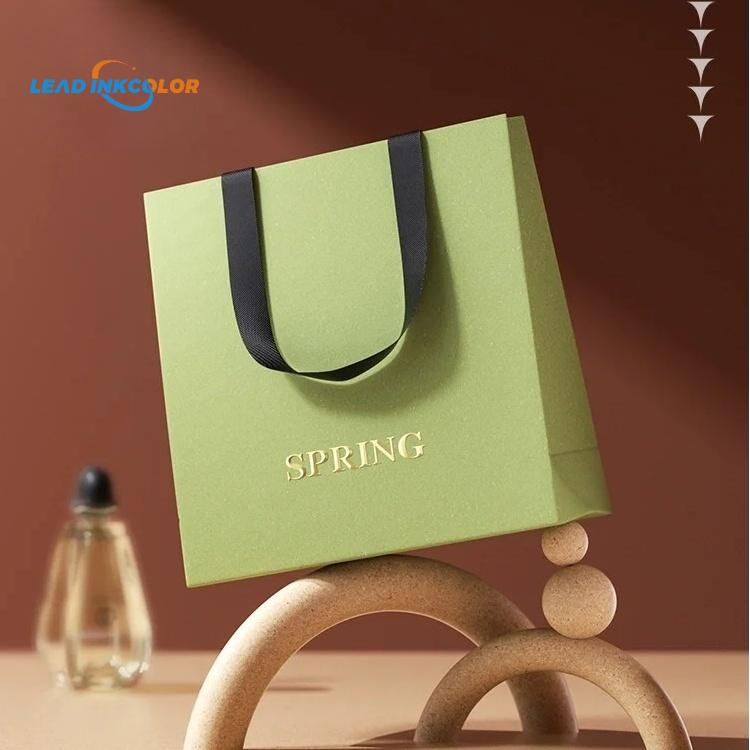
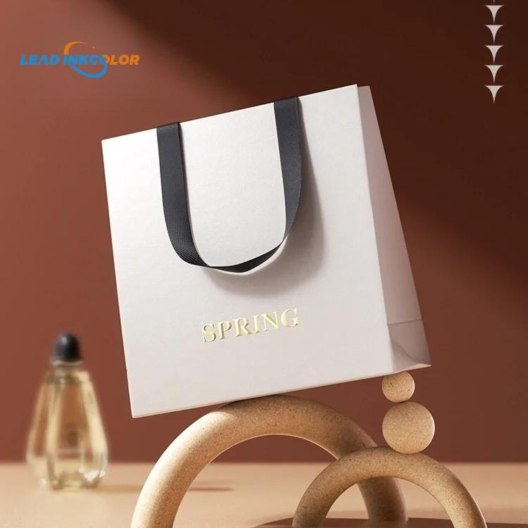
Choose a Winning Color Palette
The color palette is one of the most critical elements of perfume packaging design. It’s often the first thing that grabs our attention and plays a significant role in our emotional connection with the brand. Here are some tips for selecting a winning color palette:
- Consider the emotional resonance of different colors: For example, red can evoke excitement and passion, while blue can convey trust and calmness.
- Personality matters: Mirroring the personality of your brand, the colors you choose should reflect its values and the emotions you want to evoke in your customers.
- Limit your palette: Too many colors can be overwhelming, so focus on 2-3 main colors and their variations to create a cohesive visual identity.
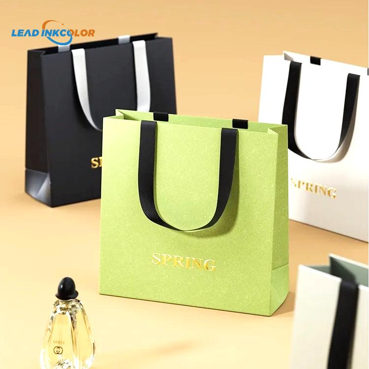
Some popular color combinations for perfume packaging include:
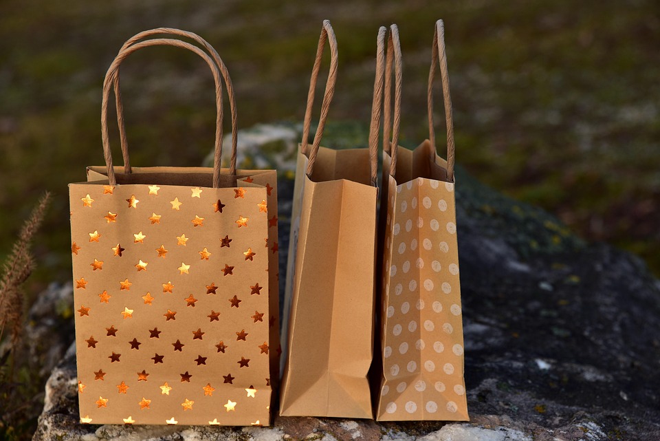
- Earthy tones (combine brown, beige, and green for a natural, organic feel)
- Moody tones (pair black, navy, and purple for a dramatic, mysterious look)
- Bright and bold (mix hot pink, yellow, and orange for a playful, energetic vibe)
Remember, the color palette should be an extension of your brand’s personality and evoke the emotions you want to associate with your perfume.
Typography That Makes a Statement
Good typography can make or break the design of your perfume packaging. Here are some tips for choosing typography that makes a statement:
- Be bold: Use a mix of font sizes, weights, and styles to create visual interest and hierarchy.
- Keep it simple: Avoid using too many fonts or font styles, as this can create visual clutter.
- Custom typography: Consider commissioning a custom font that reflects your brand’s personality and sets you apart from the competition.
Some popular typography for perfume packaging includes:
- Script fonts (e.g., handwritten, cursive, or elegant) for a romantic, luxurious feel
- Sans-serif fonts (e.g., clean, geometric, or futuristic) for a modern, edgy look
- Textured or distressed fonts (e.g., worn, vintage, or distressed) for a unique, nostalgic touch
By choosing typography that complements your color palette and brand personality, you’ll create a design that’s both visually appealing and on-brand.
Care and Feeding of Your Packaging Design
Once you have a solid design concept, it’s essential to consider the various ways in which it will be used and viewed. Here are some tips for ensuring your packaging design holds up to the rigors of retail, e-commerce, and in-store displays:
- Scalability: Design your packaging to be easily readable and recognizable at various sizes, from small to large.
- Materiality: Consider the type of materials needed for your packaging, such as glass, plastic, or paper, and design with those materials in mind.
- Color and contrast: Ensure your design has sufficient contrast and color to be easily readable, even in low-light conditions.
By thinking ahead to how your packaging will be used and viewed, you’ll create a design that’s both practical and effective.
Conclusion
Designing a successful perfume packaging is a complex process that requires careful consideration of various elements, from the fragrance itself to the color palette, typography, and overall aesthetic. By following the key tips and tricks outlined in this article, you’ll be well on your way to creating a design that showcases your brand’s unique identity and resonates with your target audience. Remember to stay focused on your brand’s personality, values, and values, and to consider the various ways in which your packaging design will be used and viewed. With these factors in mind, you’ll be able to create a design that is both visually appealing and effective in the marketplace.
FAQs
Q: What are the most important elements to consider when designing perfume packaging?
A: Key elements include the fragrance itself, color palette, typography, and overall aesthetic, as well as the brand’s identity, values, and personality.
Q: How do I choose the right color palette for my perfume packaging?
A: Consider the emotional resonance of different colors, the personality of your brand, and the emotions you want to evoke in your customers. Limit your palette to 2-3 main colors and their variations to create a cohesive visual identity.
Q: What type of typography is best for perfume packaging?
A: Consider using bold, custom typography that reflects your brand’s personality and sets you apart from the competition. Mix and match font sizes, weights, and styles to create visual interest and hierarchy.
Q: How do I ensure my packaging design is scalable, readable, and recognizable at various sizes?
A: Design your packaging to be easily readable and recognizable at various sizes, and consider the type of materials needed for your packaging (e.g., glass, plastic, or paper) and design with those materials in mind. Ensure sufficient contrast and color to be easily readable, even in low-light conditions.
Q: What are the most popular color combinations for perfume packaging?
A: Some popular combinations include earthy tones (brown, beige, and green), moody tones (black, navy, and purple), and bright and bold (hot pink, yellow, and orange).
[ad_2]