-
ホーム 東莞厚街工業園区
The Art of Color Selection in Perfume Packaging: A Guide
[ad_1]
はじめに
Perfume packaging is an essential part of the overall brand experience, and one of its most crucial elements is the selection of colors. A well-chosen color scheme can elevate a fragrance’s identity, communicate its essence, and create a lasting impression on customers. In this article, we will delve into the art of color selection in perfume packaging, exploring the principles, best practices, and creative approaches to help you master this critical aspect of perfumery marketing.
Psychological Implications of Color
Colors have a profound impact on our emotional and psychological responses, influencing our moods, behaviors, and perceptions of products. In the context of perfume packaging, understanding the psychological effects of colors is crucial. Here’s a brief overview of some key color implications:
- Red:** A bold, attention-grabbing color often associated with passion, energy, and excitement. Ideal for dramatic, sensual, or masquerade-inspired fragrances.
- Orange:** Stimulates creativity, playfulness, and warmth. Perfect for youthful, refreshing, or adventurous scents.
- Yellow:** Brightens moods, symbolizes happiness, and represents sunshine. Suitable for uplifting, citrusy, or floral fragrances.
- Blue:** Calming, trustworthy, and dependable. Ideal for serene, aquatic, or woody fragrances.
- Green:** Harmony, balance, and growth. Suitable for fresh, herbal, or natural scents.
- Purple:** Luxury, creativity, and wisdom. Ideal for sophisticated, oriental, or floral fragrances.
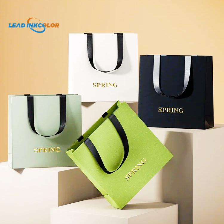
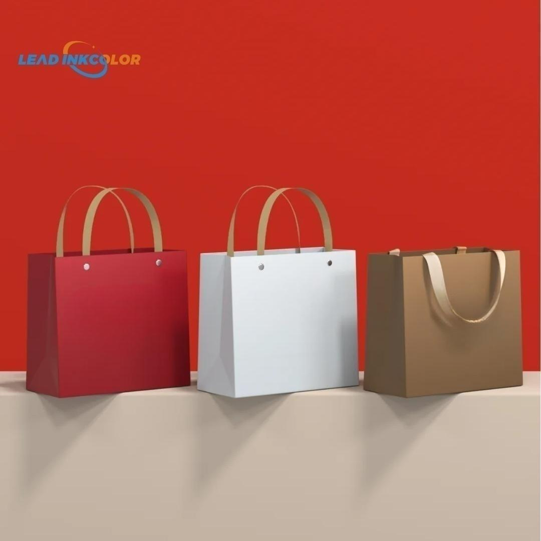
Color Harmony and Contrast
When selecting colors for perfume packaging, it’s essential to consider harmonious relationships between colors. There are several principles to keep in mind:
- Monochromatic:** Single-color schemes that create different shades and tints. Suitable for minimalist, elegant designs.
- Complementary:** Colors that create contrast while being pleasing to the eye. Ideal for bold, eye-catching designs.
- Analogous:** Colors situated next to each other on the color wheel, creating a harmonious palette. Perfect for softer, more subtle designs.
- Tertiary:** Colors created by combining primary and secondary colors, offering rich, intriguing options.
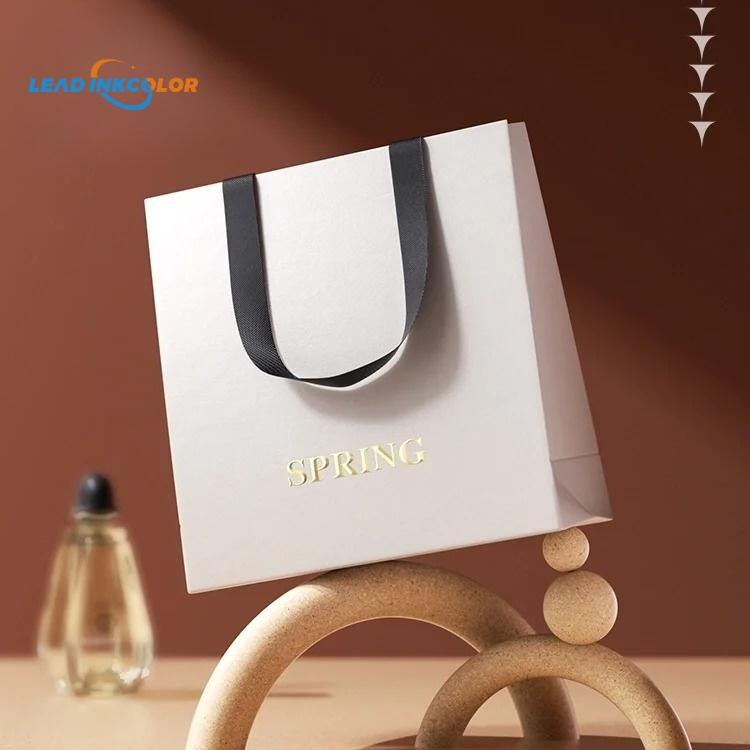
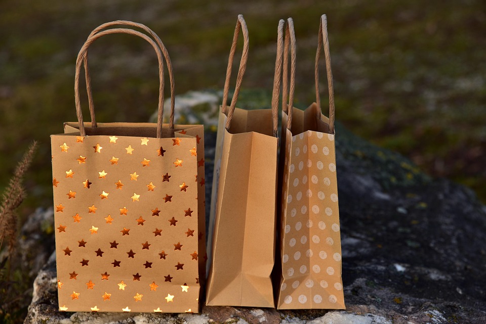
Color Considerations for Perfume Packaging
When it comes to perfume packaging, specific considerations require attention to color selection:
- Label visibility:** Ensure that the label stands out against the packaging and surrounding environment.
- Fragrance categorization:** Associate colors with specific fragrance families (e.g., bright colors for citrus, soft colors for florals) to facilitate customer recognition.
Best Practices and Creative Approaches
To create visually stunning and effective perfume packaging, follow these best practices and creative approaches:
- Test and iterate:** Experiment with different color combinations and test their effectiveness with target customers.
- Consider materials and textures:** Pair colors with materials and textures to create tactile experiences and add depth to packaging.
Conclusion
The art of color selection in perfume packaging is a nuanced and complex process. By understanding psychological implications, color harmony and contrast, and specific considerations for perfume packaging, you can create a visual identity that resonates with your target audience and elevates your brand. Remember to test and iterate, consider materials and textures, authenticate luxurious and premium products, and be mindful of printing limitations. By following these principles and staying creative, you’ll craft perfume packaging that is both aesthetically pleasing and effective in communicating your brand’s essence.
よくある質問
Q: What is the most important factor to consider when selecting colors for perfume packaging?
A: Understanding the psychological implications of colors and their relationship to the perfume’s intended emotional response.
Q: Can I use the same color scheme for all my perfume packaging?
A: While consistency is important, it’s essential to consider specific fragrance categories, brand identity, and cultural context to ensure the color scheme is effective for each product.
Q: How do I choose the right color for a specific fragrance category?
A: Consider the characteristics of the fragrance, such as its scent profile, intensity, and emotional resonance, and select colors that align with those qualities.
Q: Can I use metallic or glitter finishes in my perfume packaging?
A: Yes, but be mindful of printing limitations and ensure that the finish does not compromise packaging appearance or functionality.
Q: How do I ensure my perfume packaging stands out on store shelves?
A: Combine attention-grabbing colors with unique design elements, such as shape, typography, and texture, to create a visually striking package that captures customers’ attention.
Q: What considerations should I keep in mind when selecting colors for perfume packaging in a global market?
A: Be aware of cultural color meanings and adapt your color choices accordingly to ensure the packaging resonates with customers worldwide.
Q: Can I reuse colors from previous perfume packaging designs?
A: Consider the relevance of the colors to the current fragrance, brand identity, and target audience. If the colors are still effective, you can reuse them; otherwise, it’s essential to update the design to maintain consistency and effectiveness.
Q: How do I ensure that my perfume packaging is suitable for e-commerce?
A: Ensure the packaging design is visually appealing and functional in both online and offline settings, considering factors such as label visibility, packaging durability, and brand recognition.
Q: Can I use color to convey specific benefits or claims about the perfume?
A: Yes, use colors to communicate benefits, such as “green” for natural ingredients or “gold” for luxurious and premium products. However, ensure that the benefits are accurately communicated and compliant with regulations.
Q: What are some tips for staying creative with color selection for perfume packaging?
A: Experiment with different color combinations, consider unconventional materials and textures, and stay inspired by trends in art, fashion, and design.
[ad_2]